Developing With Webex Contact Center Header Widgets: An RSS Feed Reader Example
December 14, 2023

Today, we're going to dive into the world of Webex Contact Center development, focusing on an essential tool in our arsenal - header widgets. In this blog post, we'll use the example of an RSS feed reader and display widget to understand how to create a custom header widget and integrate it into your Webex Contact Center.
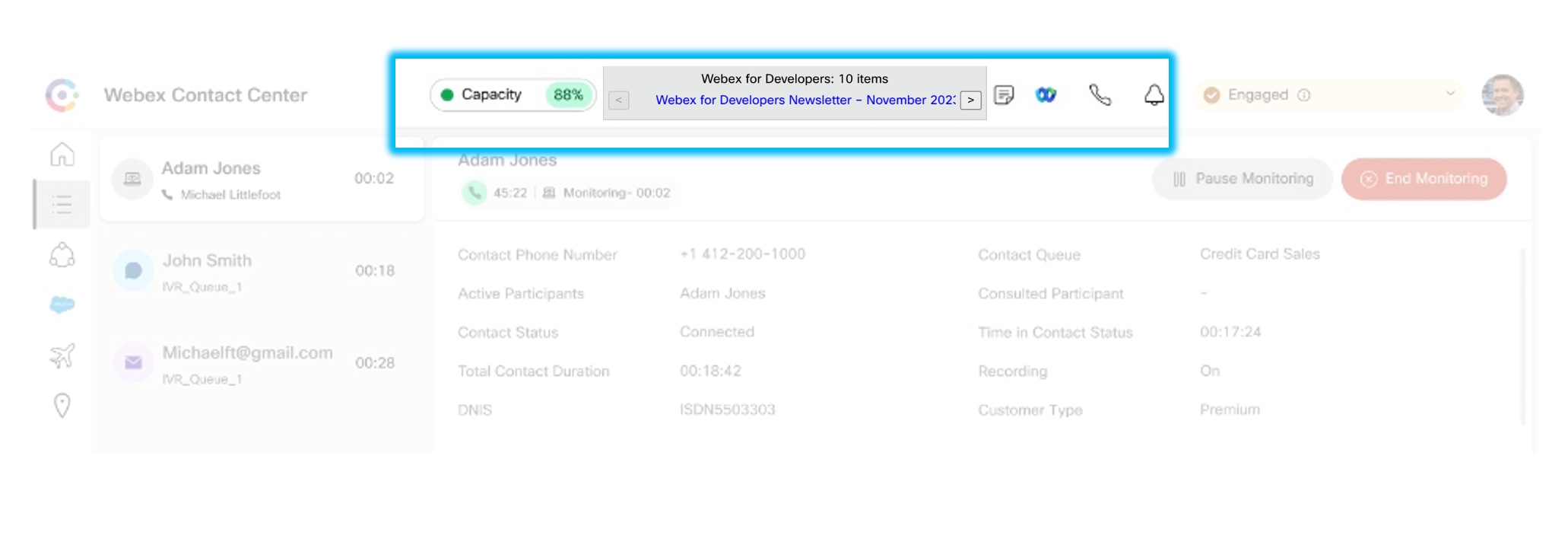
Use Cases for Header Widgets
Header widgets are key to enhancing the agent and supervisor desktop experience, bringing in a range of functionalities and information to the forefront. Here are a few use cases that highlight their importance:
- Agent Status Display: Header widgets can be employed to display the status of the agent in real-time - Available, On Call, After Contact Work, etc. This facilitates better resource allocation and management.
- Inbound Call Information: When an agent receives a call, the widget can display caller information, such as name, contact, previous call history, and more.
- Call Control: A header widget can also provide call control functionality, allowing agents to hold, mute, transfer, or end the call directly from the header.
- Real-time Updates with RSS Feed: An RSS feed reader widget can bring real-time news and updates from your preferred RSS feeds, keeping the team informed and updated without having to leave the contact center environment.
Design Guidance for Header Widgets
When developing header widgets, it's important to consider their design and layout. The header is used to display inline information, add drop-down menus, and so on. However, the header container has limited vertical space. The overall header height is only 64 pixels. This constraint means that your widget design must be compact and efficient, prioritizing essential information and functionality. Always ensure your design choices contribute to a clean, uncluttered user interface.
Web Components as Widgets
Webex Contact Center allows you to build desktop widgets using Web Components. This technology provides an excellent way to create reusable, encapsulated code blocks that can be employed across any project.
A Web Component is a single-responsibility, encapsulated code block that can be reused in any project. They are custom HTML elements, like <hello-world></hello-world>. The name must contain a dash to avoid clashing with elements officially supported in the HTML specification.
To not have styles and elements loaded for custom widgets interfere with the main Webex Contact Center styles, Web Component Widgets have access to the Shadow DOM. The widgets in the desktop layout are placed inside a nested tree of Shadow Roots and will have a Shadow Document Object Model (DOM) of their own enabled for styling encapsulation. Shadow DOM provides a way to scope CSS styles to a specific DOM subtree and isolate that subtree from the rest of the document. This way, you don’t have to concern yourself with any sort of CSS tricks or libraries to prevent leaking the styles.
Technical Development: Creating an RSS Feed Reader Widget
Let's delve into the technical aspect of creating an RSS feed reader widget. You can check out the sample code on >our GitHub repository to get a head start.
In the rss-widget.js file, we define the behavior of our custom element. Let’s look at some key code blocks:
export class RSSWidget extends LitElement {
The RSSWidget class extends LitElement, which provides a lightweight base for creating fast, reusable Web Components.
In our RSS feed reader widget, we define the widget's properties using a static getter method. This method returns an object that describes the properties of the widget. Each property has a type and some properties are reflected as attributes. Let's break it down:
static get properties() {
    return {
      rssFeed: { attribute: "rss-feed", type: String},
      currentItemIndex: { type: Number },
      items: { type: Array },
      isDarkMode: { attribute: "is-dark-mode", type: Boolean }
    }
};
rssFeed: This property is of type String and is reflected as the "rss-feed" attribute in the HTML. It holds the URL of the RSS feed that the widget displays. When this property changes, the widget fetches the new RSS feed and updates its content.currentItemIndex: This is a Number that keeps track of the index of the current item being displayed from the RSS feed. It's used to navigate through the items in the feed.items: This is an Array that stores the items fetched from the RSS feed. Each item in the array is an object representing an item from the feed, including properties like the item's title and link.isDarkMode: This new property is a Boolean that represents whether the widget should be displayed in dark mode or not. It is reflected as the "is-dark-mode" attribute in the HTML. When this property istrue, the widget should adjust its styles to provide a dark-themed user interface. If it'sfalse, the widget should use a light-themed user interface.
By defining these properties, we're telling the LitElement base class to observe changes in these properties and automatically re-render the component when they change. The attribute option ensures that the property is also observable from the HTML as an attribute, and changes in the attribute value will reflect in the property value.
async updated(changedProperties) {
  if (changedProperties.has('rssFeed')) {
    const response = await fetch(`https://api.rss2json.com/v1/api.json?rss_url=${encodeURIComponent(this.rssFeed)}`);
    const data = await response.json();
    this.items = data.items;
    this.feed = data.feed;
  }
}
In the RSS feed reader widget, the updated method is a lifecycle callback provided by the LitElement base class. This callback is invoked whenever a property defined in the properties getter changes. It receives an argument, changedProperties, which is a Map of property keys to their previous values. This updated method is responsible for fetching the new RSS feed and updating the widget's state whenever the rssFeed property changes.
render() {
const currentItem = this.items[this.currentItemIndex] || {};
return html`
<div class="rss-widget" ?is-dark-mode="${this.isDarkMode}">
<div class="feed-title">${this.feed.title}: ${this.items.length} items</div>
<div class="feed-items">
<div>
<button
@click="${this.previousItem}"
?disabled="${this.currentItemIndex === 0}"
>
&lt;
</button>
</div>
<div>
<div class="title-container">
<a class="title" href="${currentItem.link}">${currentItem.title}</a>
</div>
</div>
<div>
<button
@click="${this.nextItem}"
?disabled="${this.currentItemIndex === this.items.length - 1}"
>
&gt;
</button>
</div>
</div>
</div>
`;
}
The render method defines the widget's HTML structure, which includes a title, a list of feed items, and buttons to navigate through the items.
Adding the Widget to the Desktop Layout
The layout.json file is where we define the configuration of our widgets. This file allows us to specify which widgets to display, their position, their size, and more.
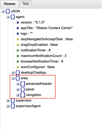
For our RSS feed reader widget, we would define its configuration as follows:
"area": {
  "advancedHeader": [
    {
      "comp": "rss-widget",
      "script": "http://localhost:8000/rss-widget.js",
      "properties": {
        "is-dark-mode": "$STORE.app.darkMode"
      }
    },
Let’s break down the configuration:
- "
area": This is the object that defines different areas in the layout where widgets can be placed. - "
advancedHeader": This is a predefined area in the layout where header widgets are placed. This can be thought of as the header section of the layout.
The square brackets [ ] indicate an array of widgets to be placed in the advancedHeader area.
Each object in the array represents a widget. For each widget:
- "
comp": This is the component name of the widget as it should be used in the HTML. In this case, the widget is the RSS feed reader widget, which has been defined as a custom element with the name "rss-widget". - "
script": This is the URL of the JavaScript file that defines the widget. This script will be fetched and executed to register the custom element in the browser. In this case, the script is being served locally fromhttp://localhost:8000/rss-widget.js. - "
properties": This is the html attribute passed to the component. We are using the STORE variable to communicate to our component from Contact Center if the agent has dark mode enabled.
Assigning the Layout to the Agent
Now that we have our widget added to our agent’s layout configuration, it is time to implement it in the Webex Control Hub. You will need to be an organization admin in order to edit these configurations, if you are not, we highly suggest getting a developer sandbox.
Uploading the Layout

Desktop layouts are managed in the “Desktop Layout” section of the Webex Contact Center area of the Webex Control Hub. We are going to take our new custom layout.json file and create a new layout for it. First, click the “Create Desktop Layout” button.
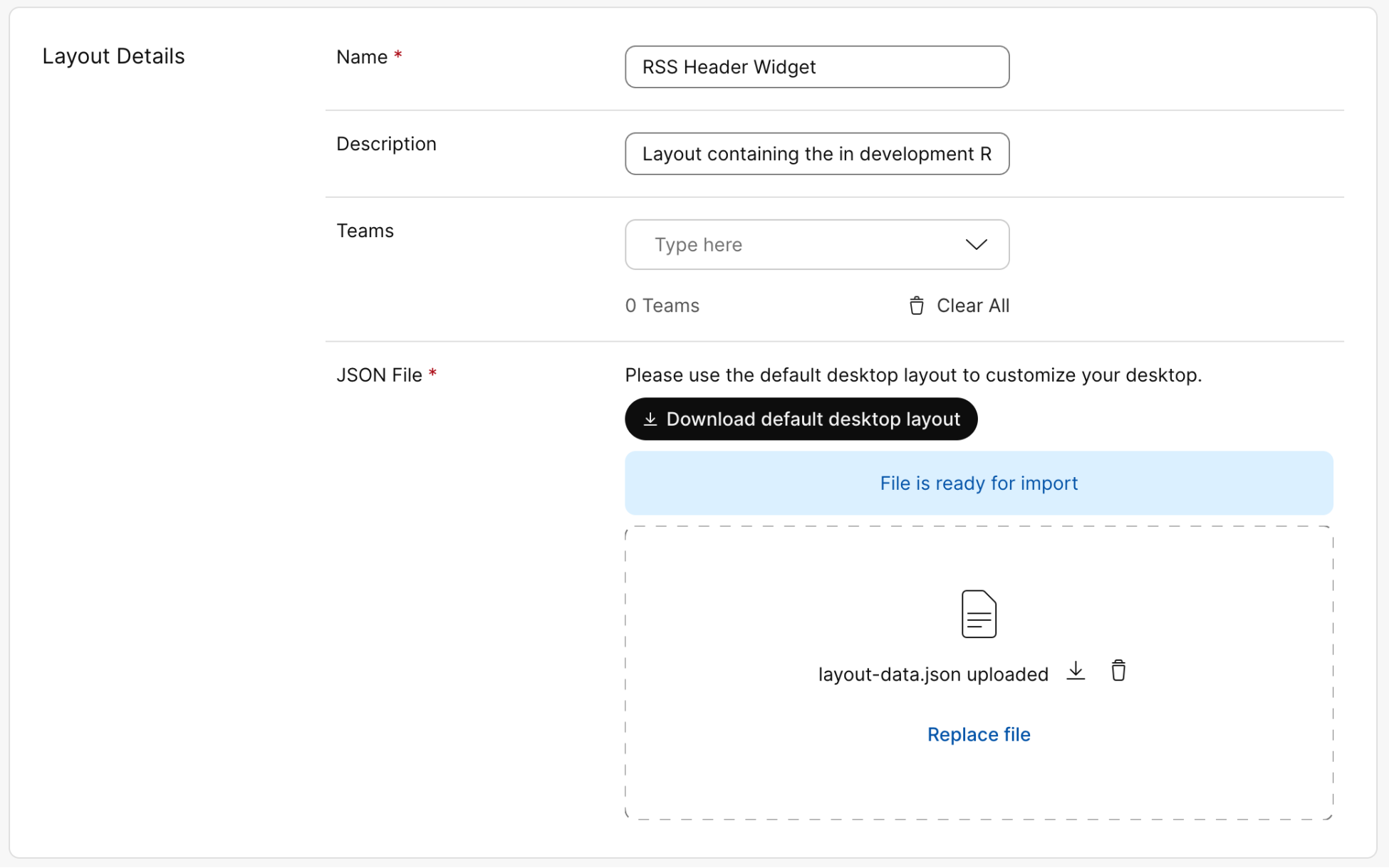
Enter details about your layout and choose the layout.json file by clicking the “Replace file” link.
Assigning the Layout
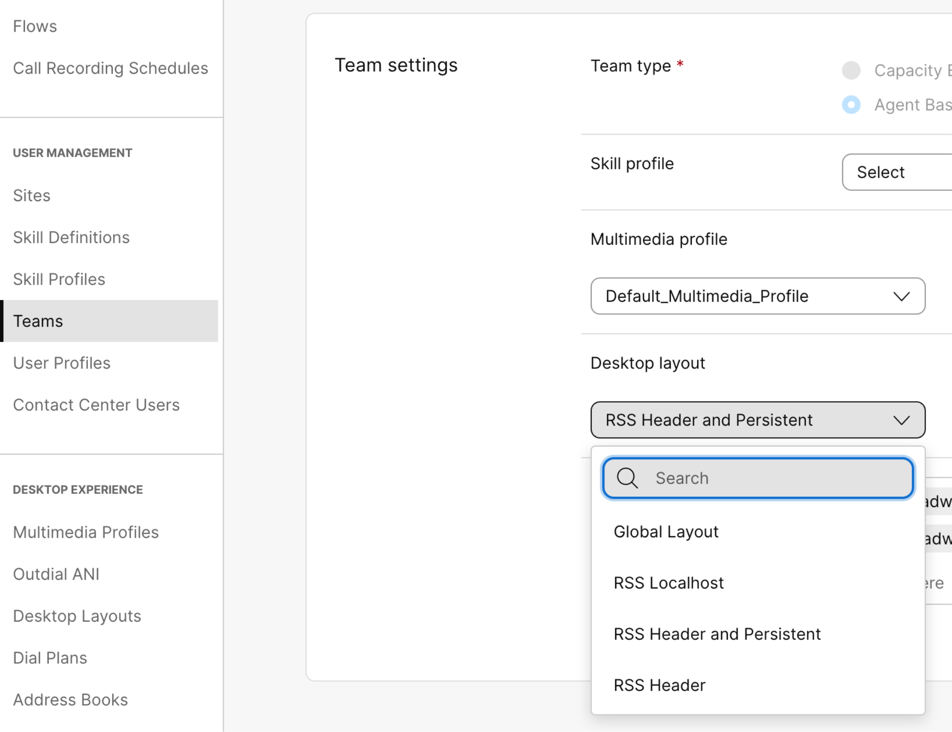
Once your header is saved, you can assign it to a “team” to test. This is under the “Teams” section in the Webex Control Hub. In the “Desktop layout” drop down, you should see your new layout you just created.
Testing via localhost
Widgets are loaded from a publicly available URL (usually from a Content Delivery Network). If you notice that our layout.json file is loading the source of our widget from http://localhost:8000/rss-widget.js. This means the layout file is trying to load from your local machine as a CDN. You can start the test development server’s CDN by calling:
npm run serve:cdn
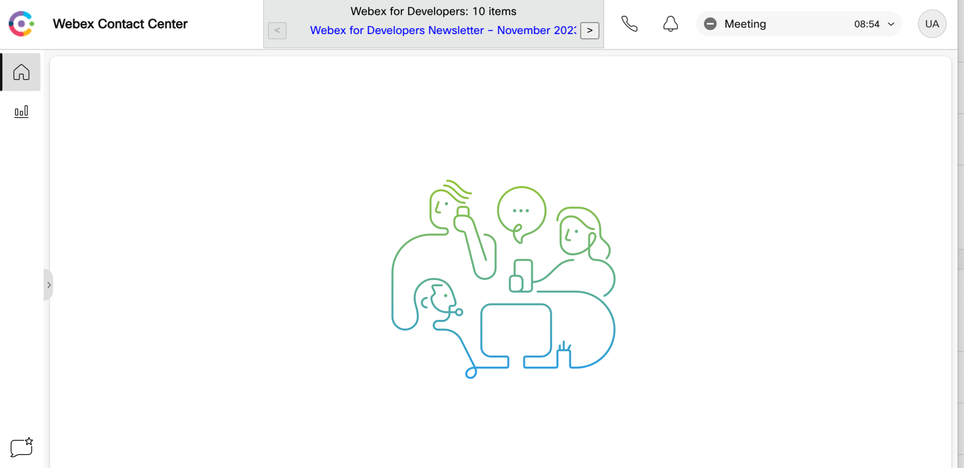
Once that is running, login to the Agent Desktop where you will see your widget running. This also makes it easy to test out your widget changes in a “production” agent environment.
Wrapping Up
In conclusion, header widgets are a powerful tool for enhancing user experience and functionality in Webex Contact Centers. With our focus on an RSS feed reader widget, we've seen how you can create custom, reusable widgets for real-time updates within your contact center. Happy coding!
Need Some Help? We Got You Covered!
We are excited to provide you with support for these features. If you need help, the Webex Developer Support Team is standing by and happy to assist. You can also start or join a conversation on the Webex for Developers Community Forum.
